What better way of commemorating 230 years of American independence than by creating an American Flag in pure CSS? Oh. Fireworks? Well, yeah, you can do that, too, I guess. But let’s stick with the CSS flag idea for now.
The goal of this exericse is to create a flag that is not only visually appealling, but is also useful: so that clicking on any of the stars will take you to a different state’s main government page, and clicking on any of the stripes will take you to—where else?—the government sites of the original thirteen colonies.
This task, while daunting, will nonetheless flex our designing muscles.
The Basic Markup
First, let’s lay the groundwork for the flag by constructing our HTML. Let’s include a title for our page, as well as the 50 states represented in the American flag. The title is wrapped in a header tag. A semantically fitting way to markup the 50 states is through a list.
So, enclose the states with an ordered list tag, and each state in a list-item tag:
<h1>
 <a href="http://www.usa.gov/">United States of America</a>
</h1>
<ol>
 <li><a href="http://www.alabama.gov/">
  <strong>State of Alabama</strong>
  <i></i>
 </a></li>
 <li><a href="http://www.state.ak.us/">
  <strong>State of Alaska</strong><i></i>
 </a></li>
 [...]</ol>
Note that we’re also linking the title, as well as each individual state, to their respective government sites. We’ve also included an extra set of italics tags within each link, which we use a selector for styling later.
We also want to distinguish the thirteen colonies from the rest of the states, as these comprise the thirteen stripes of the flag. Let’s do this by emphasizing them, wrapping them in the em tag, e.g.:
<li><a href="http://www.ct.gov/">
 <em><strong>State of Connecticut</strong></em>
 <i></i>
</a></li>
So far, what we have doesn’t look very much like a flag! That’s where the CSS comes in. Now that we have the basic markup down, let’s begin styling our page.
Creating the Easel
First, we want to create the “easel” upon which we draw our flag. We do this, by, first, further structuring our HTML. Wrap all of the page’s content within a div tag; assign it an id attribute with a value of easel:
<div id="easel">
 <h1>
  <a href="http://www.usa.gov/">United States of America</a>
 </h1>
 <ol>
  <li><a href="http://www.alabama.gov/">
   <strong>State of Alabama</strong><i></i>
  </a></li>
  [...]
 </ol>
</div>
Next, we need to style this div to create a canvas. How do we do this? Take a look at the CSS:
body {
 margin: 10px 0 0 0;
 padding: 0;
}
#easel {
 width: 955px;
 margin: 0 auto;
 position: relative;
}
We want to first, set the width of the canvas, and, secondly, center it.
To center the canvas for our flag on the page, we, first, set the margins on either side of the “easel” div to auto. The browser automatically splits the margin in half and assigns it value to the left and right.
Now, we want to clear the text from our easel, i.e., create a blank canvas on which to “paint” our flag. To do this, add the following CSS:
#easel ol {
 list-style: none;
 margin: 0;
 padding: 0;
}
#easel strong {
  display: none;
}
First, we’ve gotten rid of the preceding bullets as well as the default margins and padding. Second, we’ve hidden all of the text within the strong tag, which includes all of the list items.
Creating Stripes
Now, to begin painting our flag, let’s begin with the stripes.
Remember that the thirteen colonies, which make up the stripes on the flag are distinguished from the other states through the em tag.
So, we can create the stripes by styling this selector:
#easel em {
 width: 955px;
 height: 50px;
 display: block;
 background: #BF0A30;
 position: absolute;
 top: 0;
 left: 0;
 z-index: 1;
}
At this stage, we have set the width and height of our flag. And, after setting a background color, we’ve turned the selector into a block-level element so that we can position it on the page. We’re absolutely positioning our stripes, which means that we’re offsetting it against the edges of the parent element.
Relative positioning, alternatively, places it relative to the element’s default position on the page. So, here we’ve placing it in the upper left-hand corner of the parent element, the “easel” div: we’ve placing it zero pixels from the top, and zero pixels from the left of the edges of the containing element.
The z-index property governs the “third dimension” of the elements on the web page. That is, it specifies the elements’ stacking order. The higher an element’s z‑index number, the higher it is in the stacking order.
E.g., an element with a z‑index value of five is placed on top of an element with a z‑index value of one. We want the stripes to be placed beneath the blue field of stars, so we give that a low z‑index value of one.
Thus far, it looks like we have only one stripe! Actually, all thirteen stripes are on the page, but they are all placed in the exact same position—and they are all red. To distinguish our thirteen stripes, we have to position and color each stripe individually.
How do we pick out each specific stripe for styling? To do this, first note what attributes individuate each state in the markup:
<li><a href="http://www.ct.gov/">
 <em>State of Connecticut</em>
 <i></i>
</a></li>
Each state is marked uniquely with a different link address. We can use the href attributes to create selectors for each stripe:
#easel a[href="http://delaware.gov/"] em {
  background: white;
 top: 50px;
 left: 0;
}
#easel a[href="http://www.georgia.gov/"] em {
 top: 100px;
 left: 0;
}
[...]
Since we originally set the background color for the em selector as red, we need to change this color for all the white stripes.
Then, we just need to move each stripe from the top of the page into its designated spot. Each stripe is 50 pixels high, so the second stripe, in this case is Delaware, needs to be placed 50 pixels down. The next stripe is placed 100 pixels down, and so on.
Once we’ve finished coloring and positioning all 13 stripes as needed.
Creating Stars
Now that our stripes are in place, it’s time to move on to the stars. First, we need to create the blue field upon which the stars are placed. To do this, we’re going to transform the page header. To turn the header into a blue box, we need to hide the header text, then size, position and color the anchor selector within the header element:
#easel h1 a {
 position: absolute;
 width: 215px;
 height: 175px;
 background: #002868;
 text-indent: -9999em;
 margin: 0;
 padding: 0;
 z-index: 20;
}
Absolutely positioning the element without any offset properties place the element in the upper left-hand corner of the “easel” div, which is the containing element.
After setting the width, height, and background color, we have effectively “hidden” the header text by indenting it far off of the page.
Finally, by setting the z‑index value to 20, we’ve stacked it on top of the stripes.
To create our stars, we employ a technique similar to the method for creating the stripes. We select each state in our CSS through their unique href attribute, and then style accordingly.
We don’t want to style over the same element that makes up our thirteen stripes, so we have to use a different selector than the anchor. We use the italic tag as our selector for each of the states:
#easel ol li a[href="http://www.alabama.gov/"] i {
 background-image: url(stars.gif);
 display: block;
 position: absolute;
 top: 13px;
 left: 13px;
 z-index: 50;
 width: 24px;
 height: 23px;
}
#easel ol li a[href="http://www.state.ak.us/"] i {
 background-image: url(stars.gif);
 display: block;
 position: absolute;
 top: 13px;
 left: 90px;
 z-index: 50;
 width: 24px;
 height: 23px;
}
[...]
The star itself is a small GIF image.
We point to this image in the background-image property. Then, we position this star by moving the element from the top left-hand corner of the containing div. Each state’s star is positioned differently, according to its place on the blue field. We’ve also set its z-index value to 50, to place it on top of both the stripes and the blue field it is set against.
Once we’ve finished the tedious task of applying CSS to all fifty states, we have a completed American flag.
Adding Texture
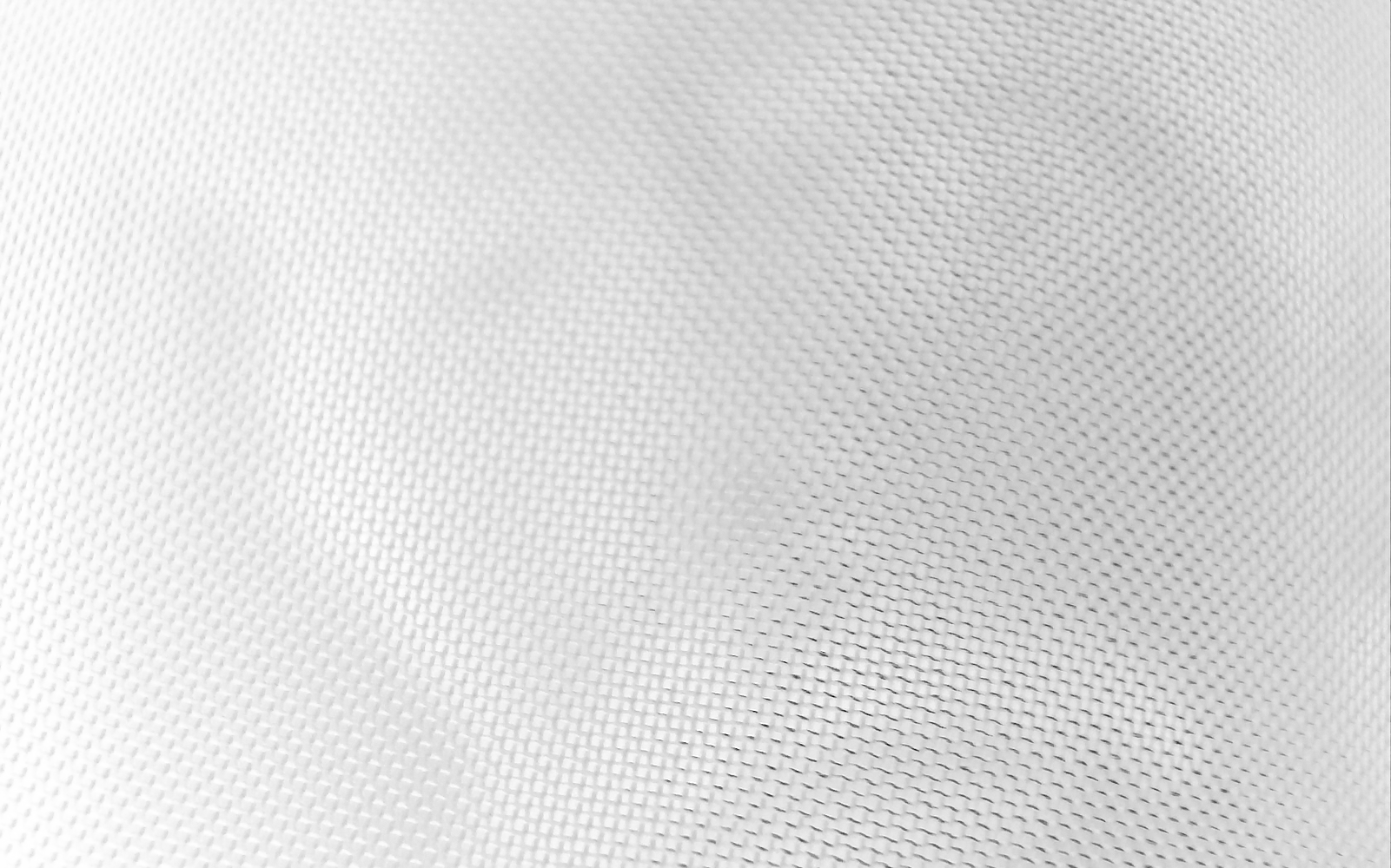
Why don’t we add some additional visual interest to our creation by adding some subtle texturing effects? This can easily be done by strategically placing some transparent PNGs as background images to our elements.
PNGs support alpha transparency which allows portions of an image to be partially transparent. This allows for some very interesting effects, such as creating the illusion of a “textured” surface.
Read my blog post “PNG Transparency for Internet Explorer (IE6 and Beyond)” to learn how to provide PNG support in order browsers. Note that this tutorial is geared towards browsers with native PNG support.
Let’s place a transparent image behind the elements comprising our flag. First, we place the image behind our red stripes:
#easel em {
 width: 955px;
 height: 50px;
 display: block;
 background: #BF0A30;
 position: absolute;
 top: 0;
 left: 0;
 z-index: 1;
 background-image: url(flag_bkgd.png);
 background-position: 50%;
 background-repeat: no-repeat;
 background-attachment: fixed;
}
We’re placing the image half-way from the left and top edge of the element, the stripe. The background-repeat property specifies that the image is not tiled, i.e., the image is not be repteated vertically or horizontally.
Let’s do the same for the white stripes:
#easel a[href="http://delaware.gov/"] em {
 background: white;
 top: 50px;
 left: 0;
 background-image: url(flag_bkgd.png);
 background-position: 50%;
 background-repeat: no-repeat;
 background-attachment: fixed;
}
And, lastly, to the blue field:
#easel h1 a {
 position: absolute;
 width: 215px;
 height: 175px;
 background: #002868;
 text-indent: -9999em;
 margin: 0;
 padding: 0;
 z-index: 20;
 background-image: url(flag_bkgd.png);
 background-position: 50%;
 background-repeat: no-repeat;
 background-attachment: fixed;
}
This final bit of CSS results in a festive American flag masterpiece that works in IE7+, Firefox 2+, Opera 9.5 and Safari.
Happy 4th of July!
Thanks for posting this for the 4th.
Your presentation at WebVisions was really worth attending!
Ah, the power of CSS. What better way to celebrate the holidays than some good ol’ fashioned web standards. I like the PNG alpha transparency too — and of course, so one can forget IE6!
Guess we can’t use this as our interview question anymore. 😉
Beautiful, patriotic and semantic. Makes me want to grill some burgers and launch Fireworks…or maybe just Textmate.
Christopher,
I really like all the links to the state government web sites and it looks great.
Nice job!
This was awesome! Fantastic job!
great flag effect